Typographic Posters.
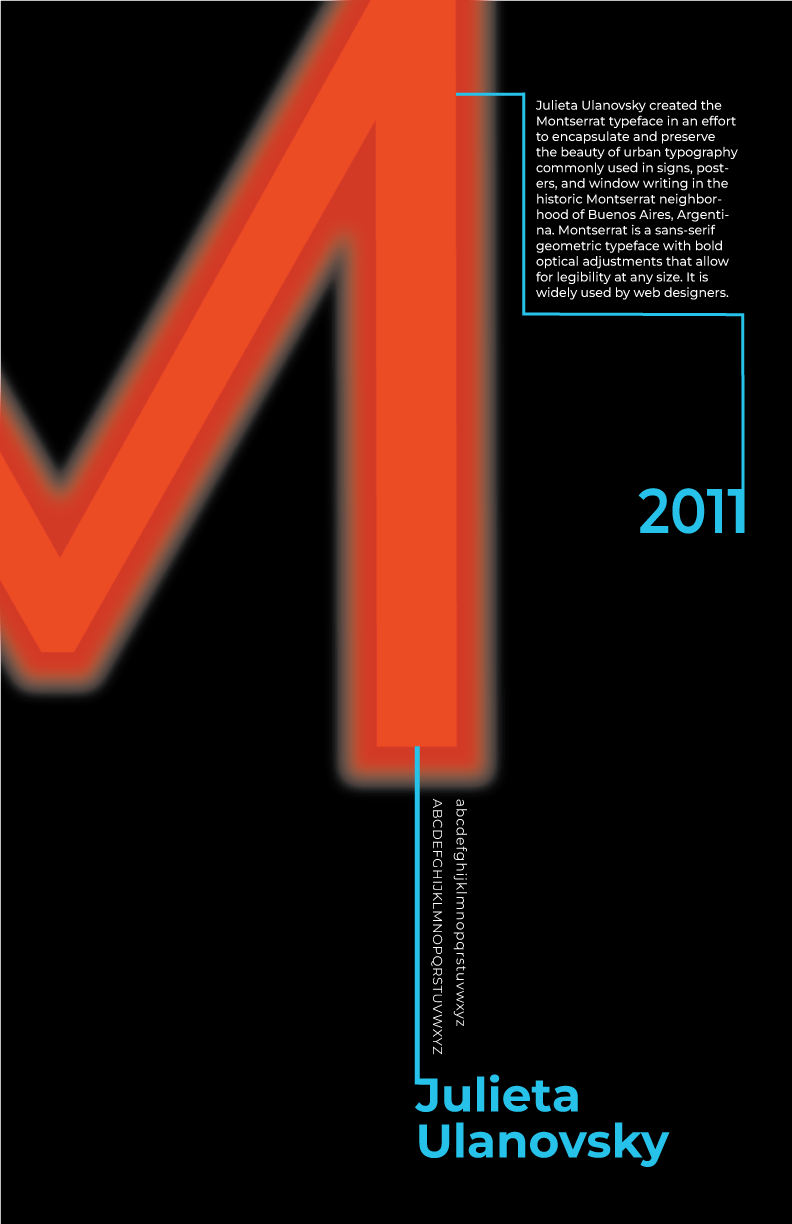
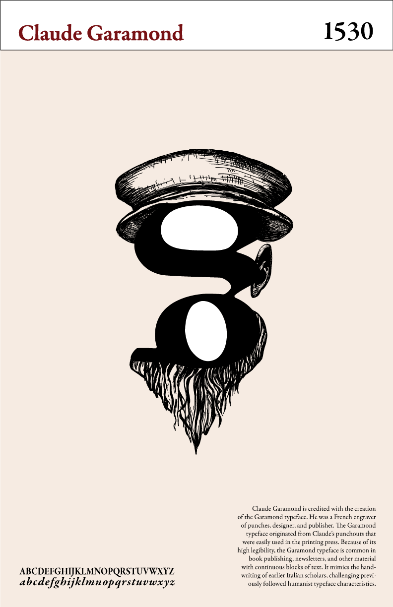
This project aimed to introduce the viewer to the qualities and characteristics of the chosen Serif and Sans Serif typefaces. The posters had to include the typeface name and creator, the year of creation, a short history, and the alphabet in both upper and lowercase. Through my research and design process, I was able to establish visual hierarchy while also introducing the viewer to the qualities and characteristics of the chosen typefaces.
Serif Typeface: Garamond:
Inspired by Claude Garamond himself, and the muted color pallatte available during the 16th century.
Sans Serif Typeface: Montserrat:
Inspired by Beunos Aires signage.


